OK, we’re back. I’m staring out at the 12 to 16 inches of snow they’re expecting to fall today, but I can’t stop thinking about Bob Costas’ eyes…yikes, those red embers are staring into my soul. Get that man some antibiotics!
"Wait," you’re thinking, "what does this have to do with e-signature predictions for 2014?" Strangely, it ties in well to our next agenda item, customer experience.
Vendors Will Wise Up and Start Providing Customized Integrations

You see, most e-signature users today develop red eyes because they have to continually switch interfaces and experiences when sending documents out for signatures. Of course, many electronic signature systems offer integrations to common enterprise systems, but when it comes to preparing documents and workflows, users often are thrown from one interface (the enterprise system) into another (the e-signature vendor’s), with a completely different look and feel.
This switch of contexts can sometimes be jarring, and even when users are well-trained and systems are designed to be easy to use, it can be confusing and upset planned efficiencies.
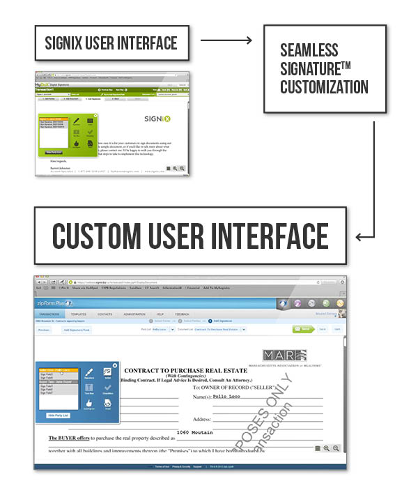
In 2014, we’re going to see more providers offering what I’ve termed "seamless" integrations, where the e-signature solution takes on the look and feel of other enterprise systems, rather than forcing users to learn a separate experience. In this way, the customer experience becomes something they expect to see and is an extension of the existing experience.
In fact, in January of this year, SIGNiX worked with one of its major partners, zipLogix to seamlessly integrate (aka Seamless Signatures™) SIGNiX transaction preparation (zipLogix Digital Ink®) into zipForms Plus. With this, adding signatures, checking status, and adding documents can now all be done without leaving zipForm Plus. This means real estate professionals can go from selecting and filling real estate forms to sending documents out for signature in a much more efficient and comfortable fashion, never having to worry about switching experiences back and forth simply to get the job done.

In a lot of ways, this seamless approach demands a good deal of ego-swallowing on the e-signature vendor’s part. The vendor’s website isn’t directly visible, its logo is generally not seen and its typical user experience is hidden by a partner’s or customer’s experience.
This becomes a more significant barrier when you consider how recipients sign documents. Users may receive an email from their bank requesting they sign documents, but instead of heading to their bank to sign, they head to the e-signature vendor’s website or link. The site may be festooned with the logo or text from the bank, but the experience is still that of the e-signature service. Making this seamless may be the next step in later 2014, but it’s fraught with more difficulties than the document preparation experience.
Why? Signing must meet certain requirements due to legal, regulatory and industry and vendor best practices. Just because asking a user to consent is an extra step doesn’t mean that it should go away. Making signing seamless will be a challenging exercise for most vendors.
Mobile Phones and Signing—Remember it's Not Just About Apps
 Much has been made of app-driven interaction on mobile devices. Nielsen’s recent Digital Consumer Report discovered that apps account for 86% of internet usage time on smartphones versus only 14% via browser-based access. There’s an app for everything, and that’s reflected in the data. One might extrapolate that an app for signing is therefore the end-all, be-all of the mobile experience. It’s not.
Now, for personal signing… say I have a document that’s been sent to me via paper, and I want to take a picture of it and finger-draw my name on top of it… well, that makes sense for an app, because I’ve made a personal decision to take that kind of action as opposed to simply pulling out a pen. I’ll go download an app that makes that easier for me. However, that’s not always the case.
In most workflow-driven e-signature solutions, signers are not repeat users. They may receive an email to sign a document out of the blue, or it may be something they have to do once a year, or infrequently at best. In these scenarios, one cannot expect signers to go out and download an app simply to sign a document. A direct web link to the signing process in an email is the best route, because it minimizes complications and starts the process immediately, regardless of location or the ability to download a specific app.
On the desktop, historically, this has been called a zero-footprint solution, where the web browser is all a user needs to complete a specific task and there’s no need to download anything simply to get the task done. On mobile devices in general, for signers of workflow-based signatures, I would argue that this philosophy continues to have value.
If only that's all we e-signature vendors had to worry about on mobile. On a tablet, we can generally use much the same web interface as we might on a desktop because the screen real estate, while smaller, isn’t dramatically different. But on smartphones and so-called "phablets," it’s another story.
At five inches or less, you’re looking at trying to present information on screens smaller than an index card. And despite the fact that more pixels are being jammed into those screens, all you’re getting is a sharper index card. With such a small display, some might argue that users shouldn’t be reviewing critical legal documents or placing their signatures on these documents at all. Lawyers and compliance professionals might feel better simply locking out mobile phones from signing processes and advising signers to go home and open the link on their laptops. That might be a logical suggestion, considering the panning and zooming required to navigate and review multiple page documents legibly. But unfortunately, in 2014, that’s not going to cut it with customers.
Users are constantly changing our expectations about how things should be done. The Nielsen report referenced earlier goes on to point out that in an average month, users are spending seven hours more time on their smartphones accessing the internet than they do on their PCs. There are lots of ways to analyze those data points, but I think what is most striking about this is assessing how that usage model affects how we think about signing on smartphones.
Smartphones allow us to quickly check the Internet for messages and status updates from work and friends without having to pull open a laptop. With that level of information a simple finger swipe away, it’s no wonder that smartphones lead in internet usage, especially given how much more mobile we are and how much more we are expected to stay in the know. This constant state of awareness based on our smartphones also means that notifications to sign documents are typically going to be received while on those smartphones, meaning that the desire to complete signing those documents will likely involve the smartphone too.
In 2014, we’re going to see more emphasis on that smartphone signing experience. Vendors will be challenging themselves to see how they can make it easy for those users to walk through the signing experience without the interface they might expect to see on a larger screen. Moreover, the ability to view documents clearly and meet all of the legal expectations of an electronic signature will also be essential to making this experience work.
The Handwritten Signature is Dead... Long Live the Handwritten Signature!
The onset of electronic signatures has long been deemed as one of the death knells of the handwritten signature. Now I don’t mean here the wet ink signature, but instead the action of a signer to inscribe their signature using a stylus, mouse or finger. An article even recently ran in The Atlantic proclaiming the slow death of the handwritten signature.
Years ago, I may have said that web-based electronic signatures would ring out the era of the traditional signature. Clicking through a signature process seems much faster than a handwritten signature, of course, and the keyboard and mouse are not the easiest way to draw one’s signature. Nor does everyone have access to signature pads. Even the early days of mobile devices didn’t change that premise. Touch screens were rudimentary and access to the internet was slow.
However, the rise of highly accurate, touch-based mobile devices like the iPhone over the past several years combined with higher bandwidth mobile internet and widely available WiFi connections mean that users now have constant access to much more natural ways to interact with documents. Because of that, I predict the handwritten signature will stay alive for some time to come.
Now does that mean EVERY signature will be done manually? No. It’s still easier to scroll through and click on signatures, but where the handwritten signature comes into play is in the appearance of those signatures. Many electronic signature solutions offer signature fonts for the user to choose from, but one has to ask, why offer them to a smartphone user if the user can simply draw their signature directly onto the screen?
Long live the handwritten signature!

With that, we’re at the end of my thoughts for 2014 and the world of electronic signatures. I fully expect there to be many surprises in the industry this year, some acquisitions, some departing members and hopefully many more customer announcements. Stick with us through 2014 and beyond for the latest in digital signature technology.
John B. Harris joined the SIGNiX team as Director of Product Management in 2012. He focuses on rigorously tying customer needs, industry trends, and technology innovations to specific product requirements, while also contributing to SIGNiX’s marketing efforts and increasing profitability by driving a product strategy that enhances SIGNiX’s leadership position.
%20formatted-1.png?width=2528&height=739&name=SIGNiX%20Logo%20Main%20(white)%20formatted-1.png)

